IBM Maximo Application Suite · Health and Predict
From 1,170 assets to 38 decisions: Maximo Health and Predict, set up and explained
Every maintenance team has the same question: which assets do we fix, which do we replace, and which can wait? This post sets up Maximo Health on a real demo plant, step by step from the admin screens, and follows the numbers all the way to a short list of assets that need action. Then it shows where Maximo Predict takes over.
- What health, criticality, risk and end of life scores are, and how each one is calculated.
- How an administrator builds them: contributors, score types, scoring groups and queries.
- How a Weibull curve turns an asset's age into a probability of failure.
- How the matrix turns hundreds of scores into a list of decisions.
- How to read one asset's dashboard: alerts, meters, reliability, asset life and AI insights.
- What Maximo Predict adds with machine learning models.
Reading time: about 25 minutes.
Before we startHealth and Predict in two minutes
Maximo Health gives every asset a set of scores from 0 to 100, calculated from data you already have in Maximo Manage: work orders, service requests, installation dates, costs, meter readings. The scores tell you which assets are in poor condition, which ones matter most to the business, and which ones are close to the end of their life.
Maximo Predict goes further with machine learning: models trained on failure history and sensor data estimate the probability that an asset fails soon and the date it is likely to fail. Its results appear in the same Health screens.
Our example. The Bedford plant from IBM's Maximo demo data: boilers, compressors, an emergency
generator, cranes, conveyors and HVAC units. We log in as an administrator (maxadmin) on MAS 9 and use the
Health and Predict application.
Chapter 1Where we start: 1,170 assets, one score each
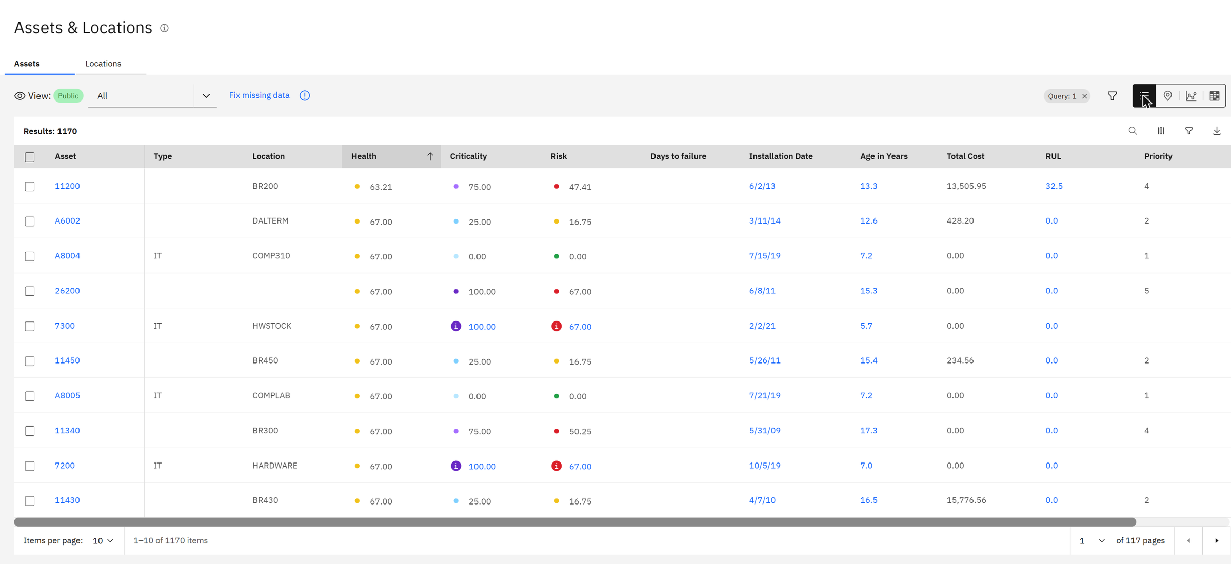
Out of the box, Health already scores every asset. The asset list shows health, criticality and risk side by side; sort by health and the weakest assets come first.
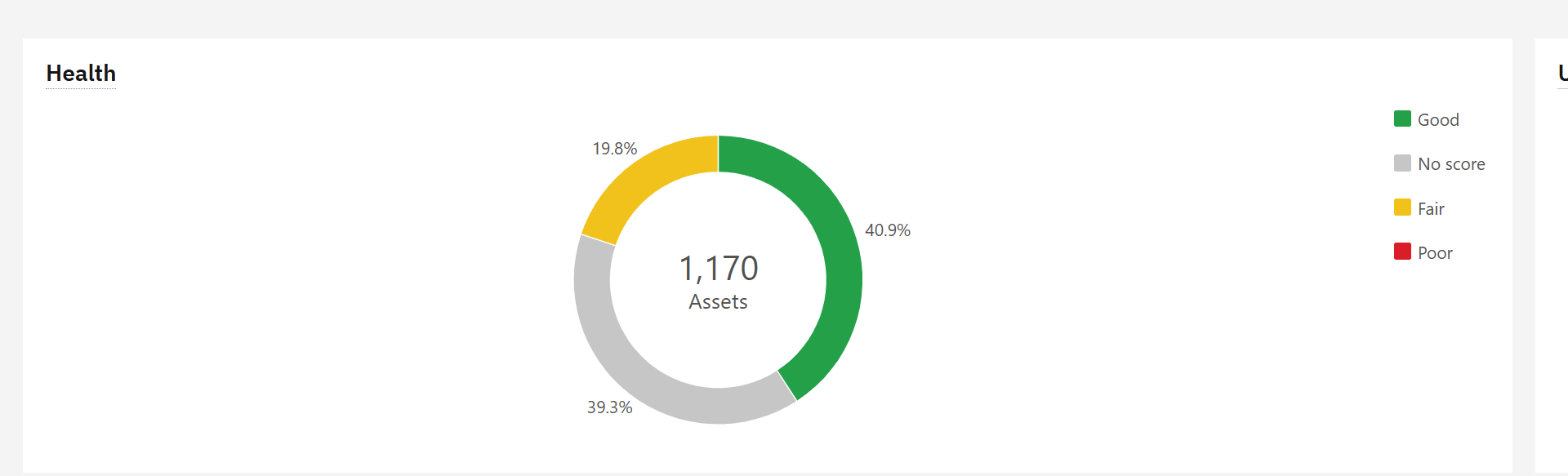
The dashboard view sums it up. Four assets in ten are in good health, two in ten are fair, and almost four in ten have no score at all, usually because data is missing.
Health calculates scores from records. An asset with no installation date, no priority and no work history cannot be scored. The Fix missing data link on this page lists exactly which fields are empty: it is often the first clean-up project in a Health rollout, and a valuable one in itself.
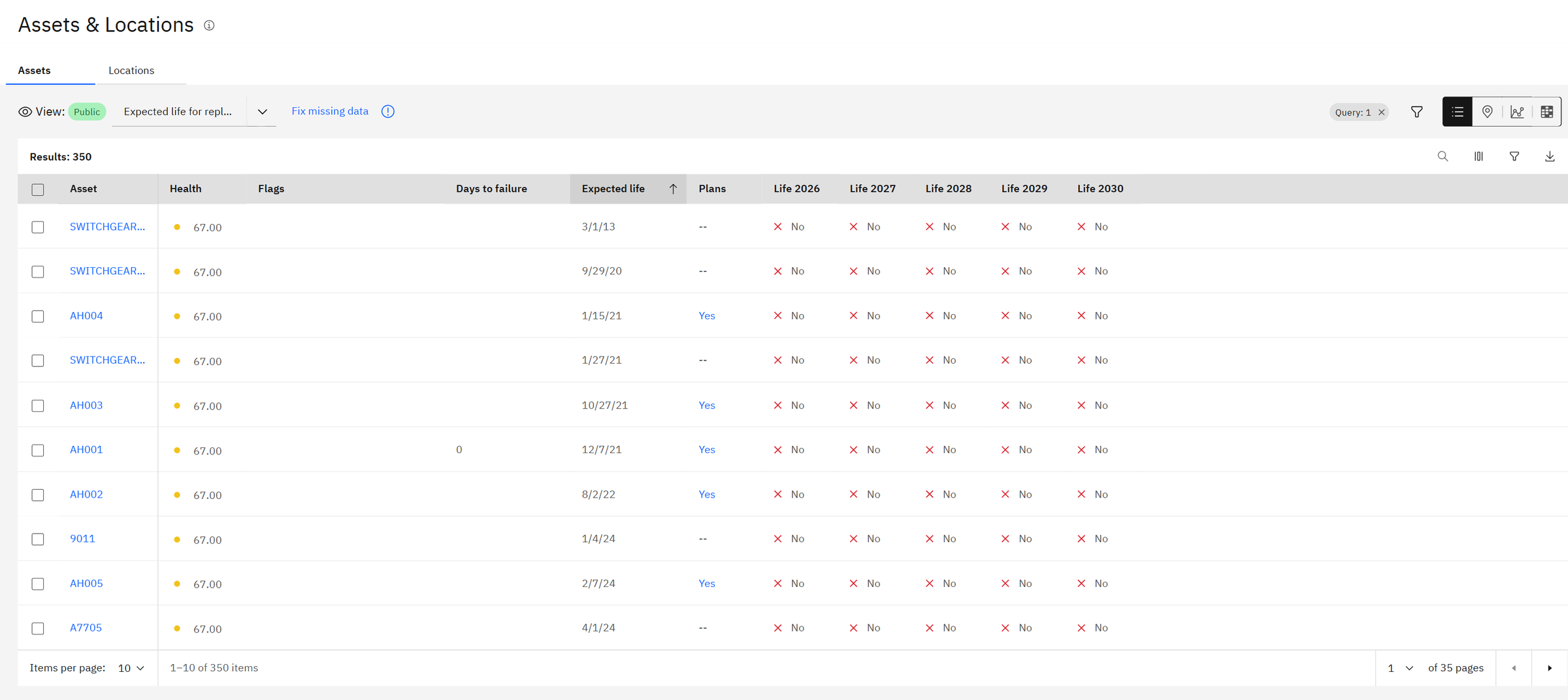
The same list can be switched to other views, saved queries with their own columns. The view Expected life for replacement answers a planning question directly: for each asset, its expected end of life, whether a replacement plan already exists, and whether it reaches end of life in each of the next five years.
The fourth way to look at the fleet is the map. Each asset is drawn at its location and coloured by its health (good, fair, poor, partial or no score), so a regional manager sees at a glance where the problems are.
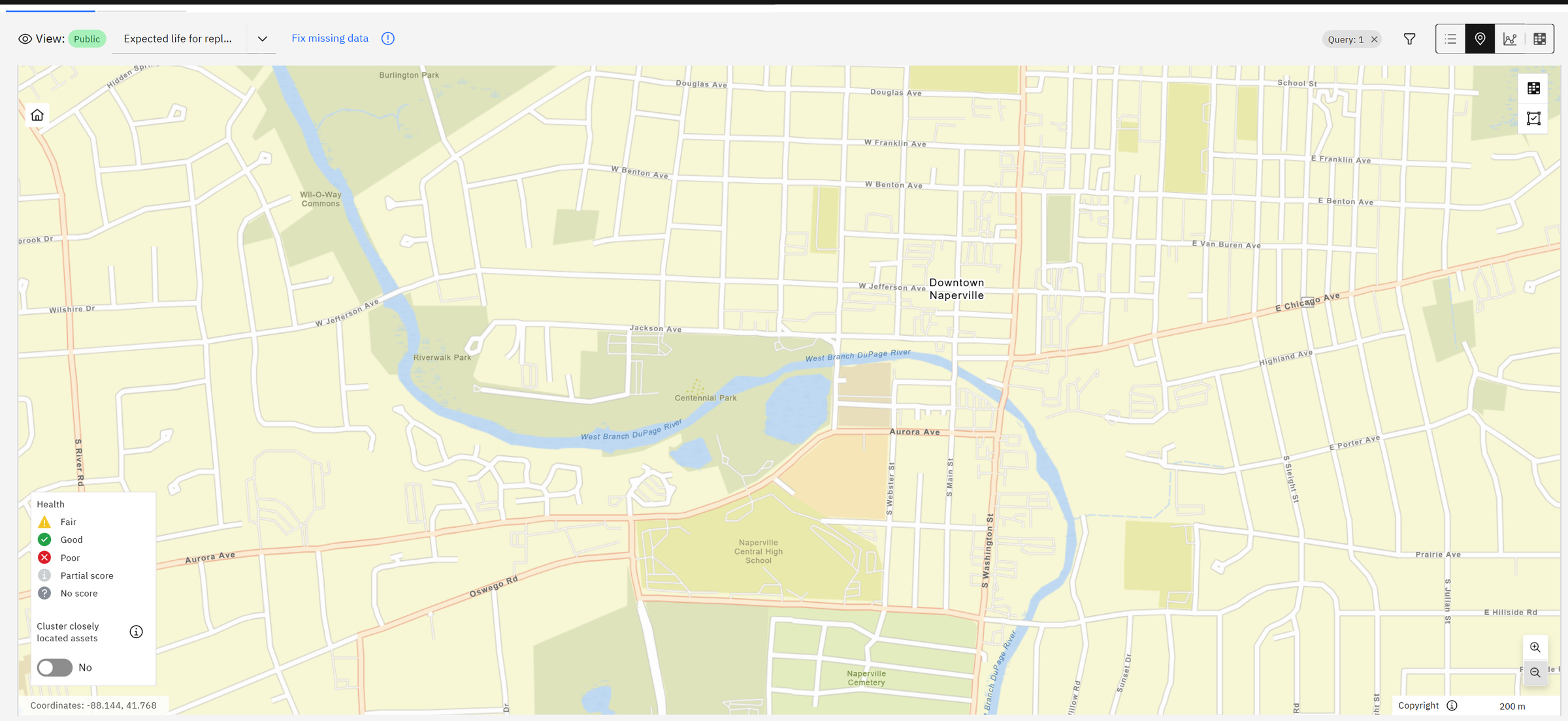
An asset appears on the map when it has a geometry (a point drawn in Maximo Spatial or loaded from GIS) or a service address with coordinates. Assets without either are listed in the "Some assets are not shown" message. Loading coordinates once, from the GIS or a simple import, makes the whole fleet visible.
Chapter 2How the default scores are built
The scores come from a scoring group: a set of assets plus the scores calculated for them. Health ships with one, Default_scores, which covers every asset with three scores.
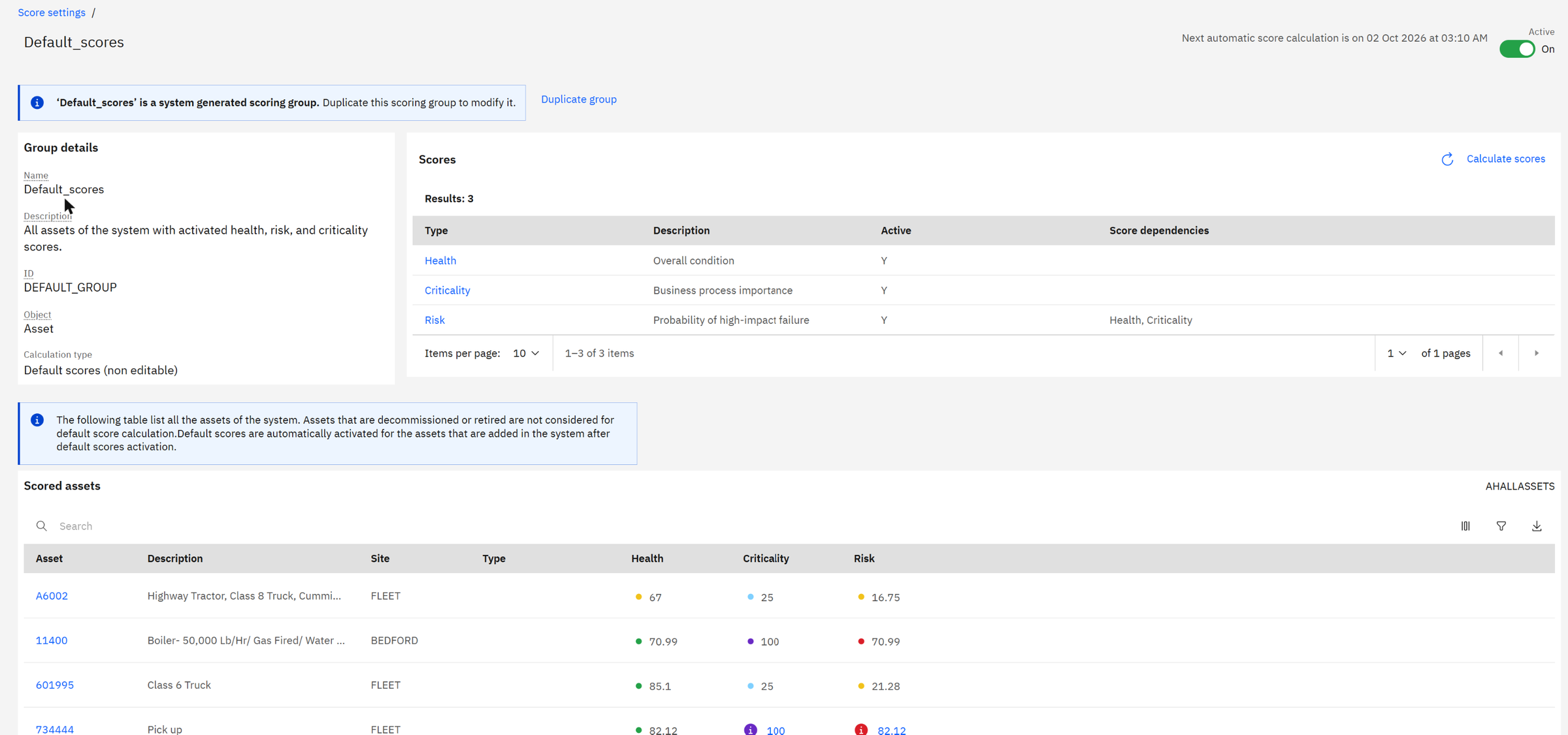
Open the Health score and you see its recipe. It has three contributors, each with a weight.
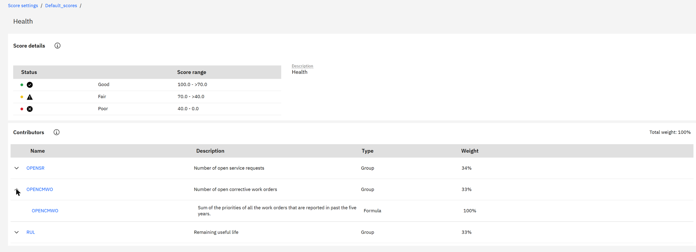
A contributor is one measurable fact about an asset, turned into a number from 0 to 100. The score is the weighted average of its contributors. Here: how many service requests are open, how many corrective work orders were reported in the last five years (weighted by priority), and how much of the asset's expected life is left.
The HVAC system 11200 was installed in June 2013, so it is 13.3 years old. Health shows 32.5% of its useful life left. So its expected life is 13.3 ÷ (1 − 0.325) ≈ 20 years, and about 6.7 years remain.
Criticality answers a different question: how much does this asset matter? By default it comes from one contributor, the asset's priority in Manage, and is shown as a letter from A (most critical) to E.
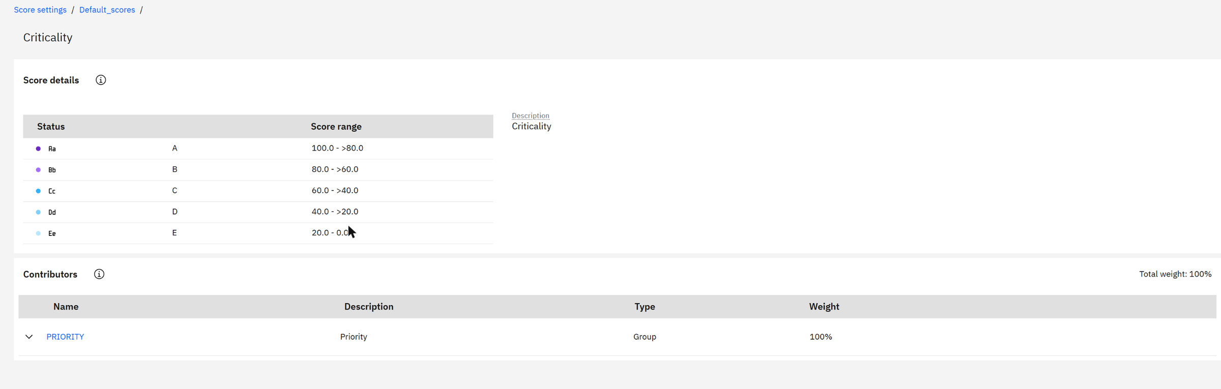
Priority runs from 1 to 5 and becomes a score from 0 to 100: priority 1 → 0, 2 → 25, 3 → 50, 4 → 75, 5 → 100. The HVAC system has priority 4, so its criticality is 75, band B.
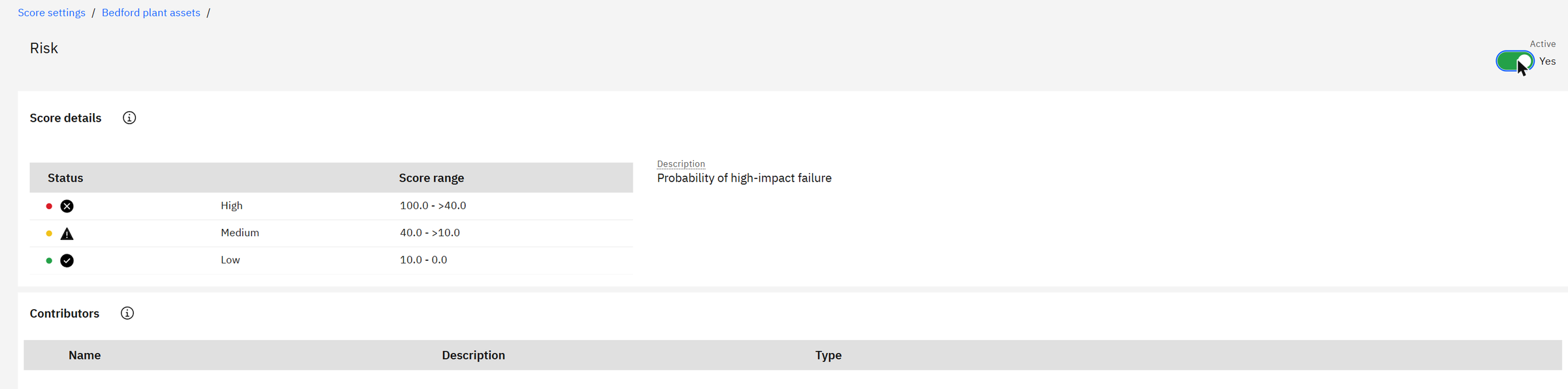
Risk combines the two: an asset in poor health that the business depends on is a high risk; the same asset in a storeroom is not.
Chapter 3The building blocks an administrator works with
Everything above is configurable in Score settings. Two tabs matter most. Score types define what each score means and where its colour bands start and stop.
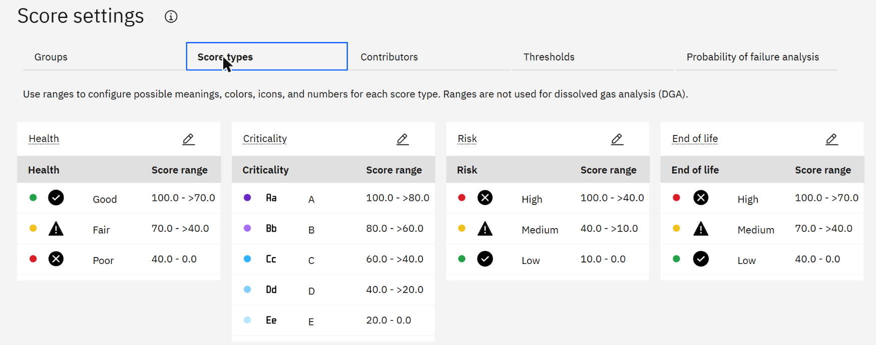
Contributors are the formulas. IBM supplies defaults and samples, and you can write your own. Here is the sample that measures age:

Contributors measure very different things: days, dollars, counts. To combine them, each one is mapped to 0–100 between a best and a worst value. For the age contributor, a new asset scores 100 and an asset of 20 years or more scores 0; an asset of 10 years scores 50.
Chapter 4Building our own scoring group for Bedford
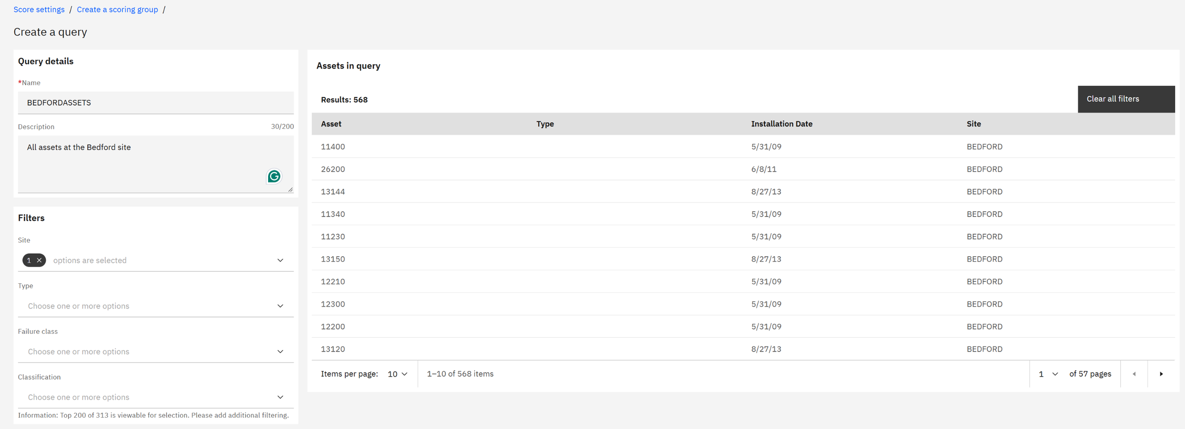
The default group is read-only and covers everything. Real projects create their own groups, one per asset class or site, so each can have its own recipe. We create one for the Bedford plant.
First, the assets. A group is fed by a query; assets join and leave the group automatically as they match it. The query builder needs no SQL: we filter on site BEDFORD and get 568 assets.
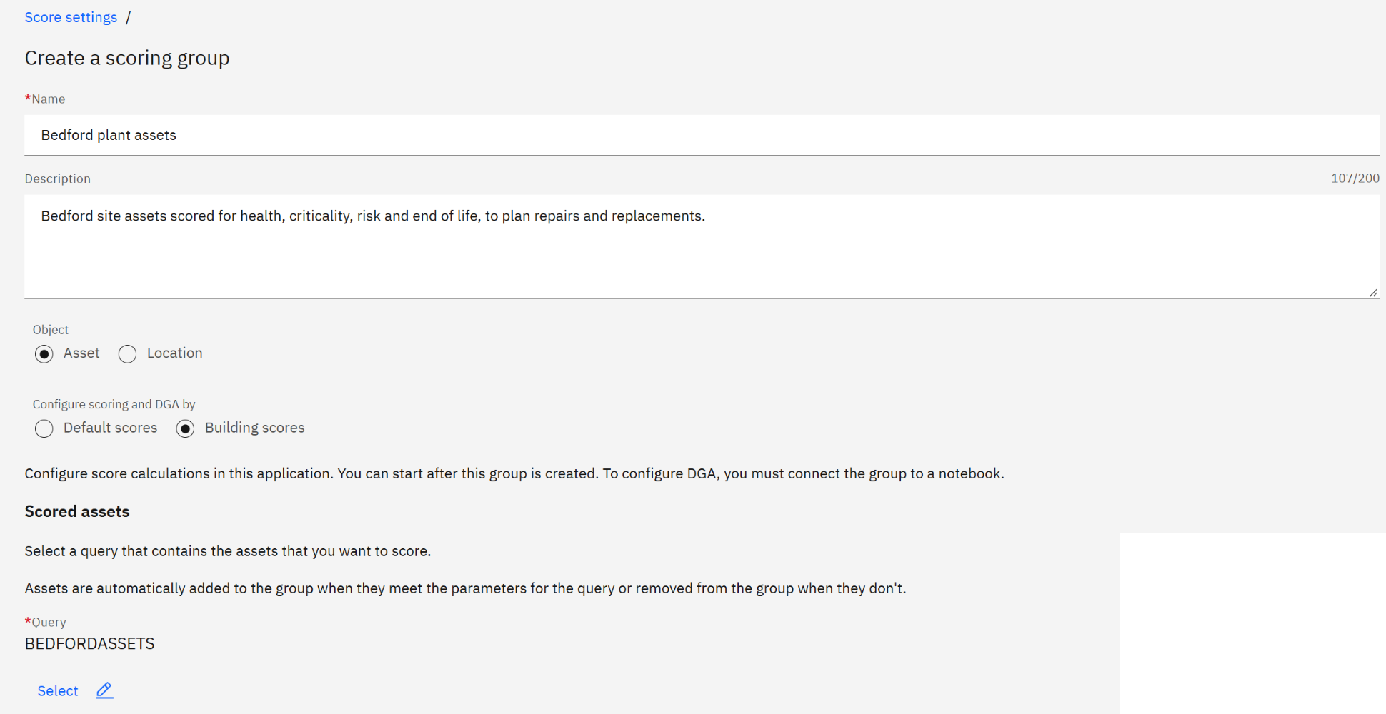
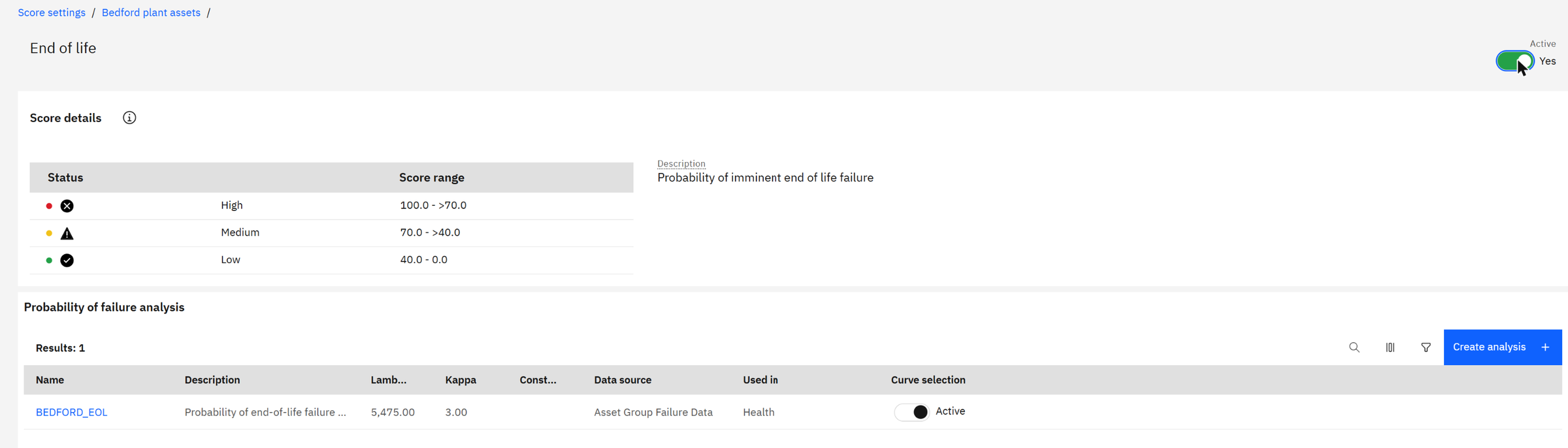
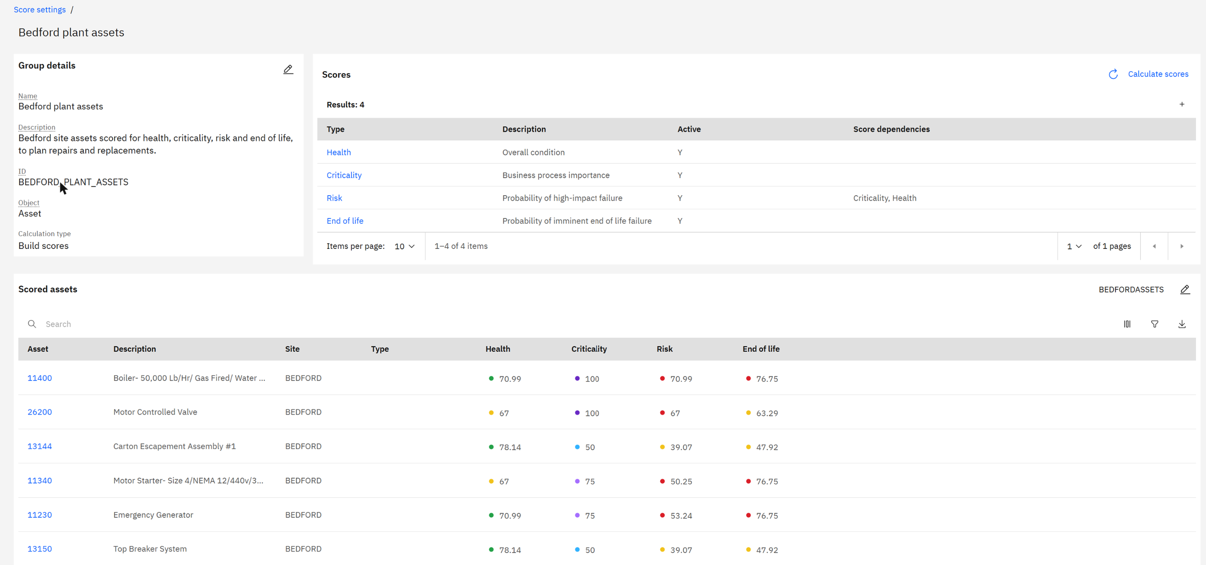
Then the scores. We add the standard Health, Criticality and Risk, switch each one on, and add the one score the default group does not have: End of life.
Chapter 5End of life: when does an asset wear out?
Health tells you how an asset is doing today. End of life tells you how likely it is to fail because it is old. It is driven by a probability of failure curve that you define once for the group.
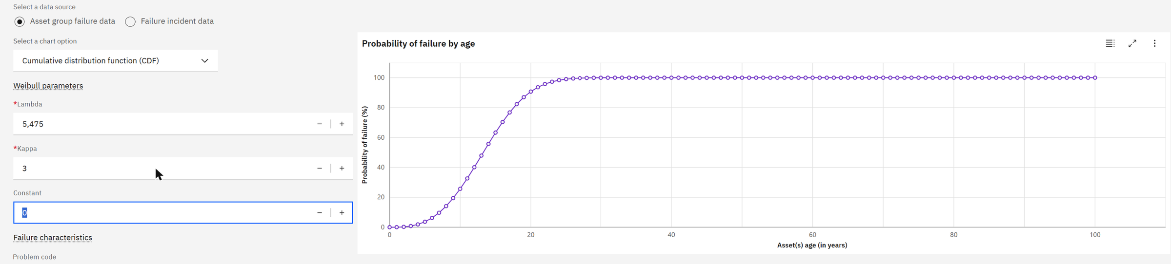
The Weibull distribution is the standard model for equipment life. It has two parameters. Lambda (λ) is the characteristic life: by that age, 63% of similar assets have failed. Kappa (κ) is the shape: below 1 means early failures, 1 means random failures, above 1 means wear-out, where failures pile up with age. Kappa 3 is typical of mechanical equipment.
Health can fit the curve from your own failure history, or you can enter values from the manufacturer or from experience.
Probability of failure by age t: F(t) = 1 − e−(t/λ)κ, with λ = 15 years and κ = 3.
At 13 years: (13/15)³ = 0.65 → F = 1 − e−0.65 = 48%. At 17 years: (17/15)³ = 1.46 → F = 77%.
Those are exactly the End of life scores Health calculated: 47.92 for the assets installed in 2013, and 76.75 for those installed in 2009.
One click on Calculate scores and every Bedford asset has four scores.
Chapter 6One asset, every angle: the HVAC system 11200
Scores are useful for ranking. Decisions are made on one asset at a time, and for that Health gives each asset a dashboard with six tabs. We follow the weakest asset at Bedford, the 50-ton HVAC system 11200 that serves the main office, through all of them.
Health: the scores and where they come from
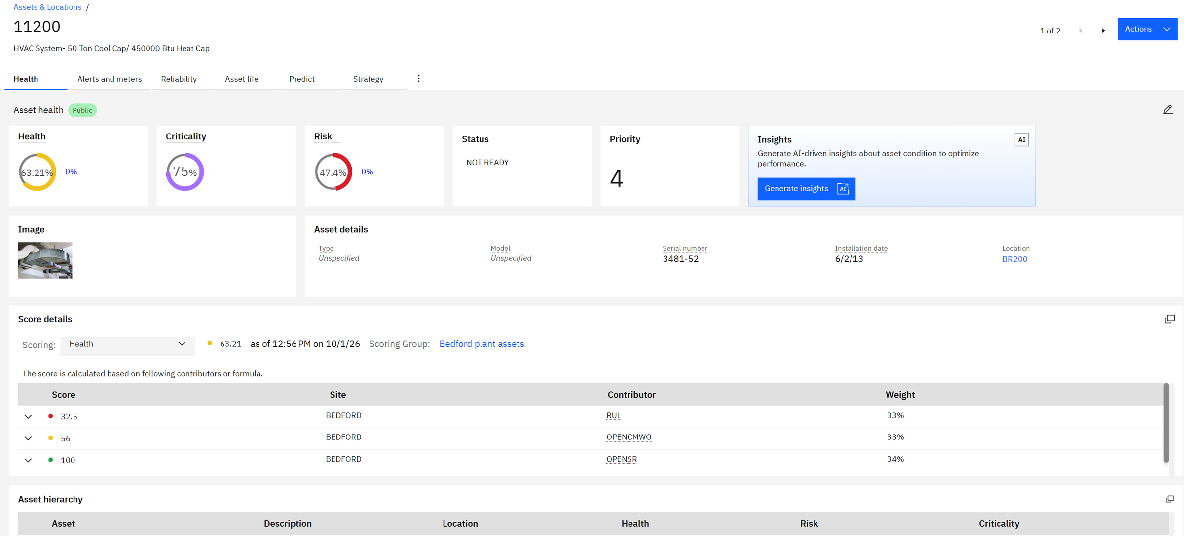
The score details explain the 63.21 without any guesswork. Remaining useful life scores 32.5 (red: two thirds of the expected life are used), open corrective work orders score 56 (yellow: a fair amount of repair work), and open service requests score 100 (green: none open).
Health = 0.33 × 32.5 + 0.33 × 56 + 0.34 × 100 = 10.7 + 18.5 + 34.0 = 63.2. That is the 63.21 on the screen.
So the unit is not "fair" because of complaints from users, but because it is ageing and keeps needing repairs.
Insights: an AI summary of the asset's condition
The Insights card on the same tab asks watsonx, IBM's generative AI, to read everything Maximo knows about the asset (work orders, alerts, meters, scores) and write a condition summary a supervisor can read in a minute.
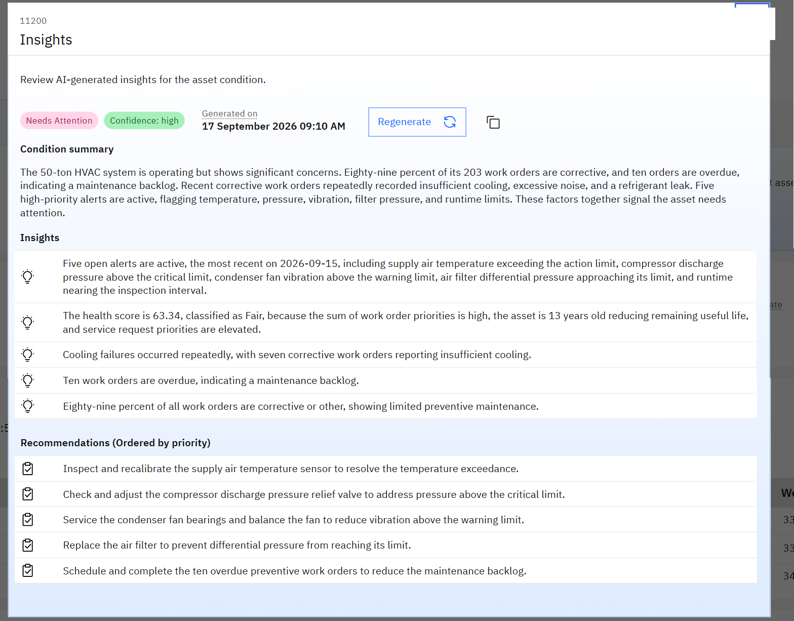
This is where the screens turn into a story. Of its 203 work orders, 89% were corrective: the unit is repaired after it fails much more than it is maintained before. Seven work orders report insufficient cooling, ten are overdue, and five alerts are open. The recommendations are concrete: recalibrate the supply air temperature sensor, check the compressor discharge relief valve, service the condenser fan, replace the air filter, and clear the overdue preventive work.
None of these facts is new; they are all in Maximo. What used to take a reliability engineer an hour of reports, the insight puts in one page, in plain language, with a recommended order of work. The engineer still decides; the AI does the reading.
Alerts and meters: what the asset is telling us now
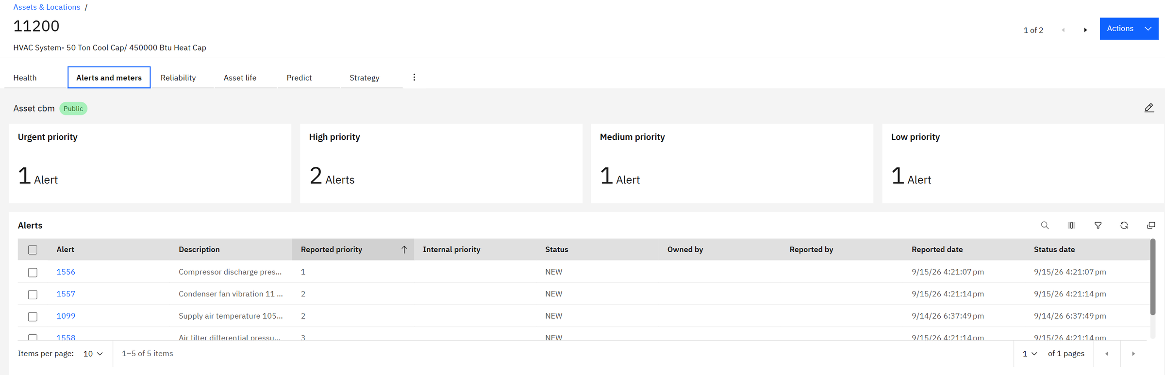
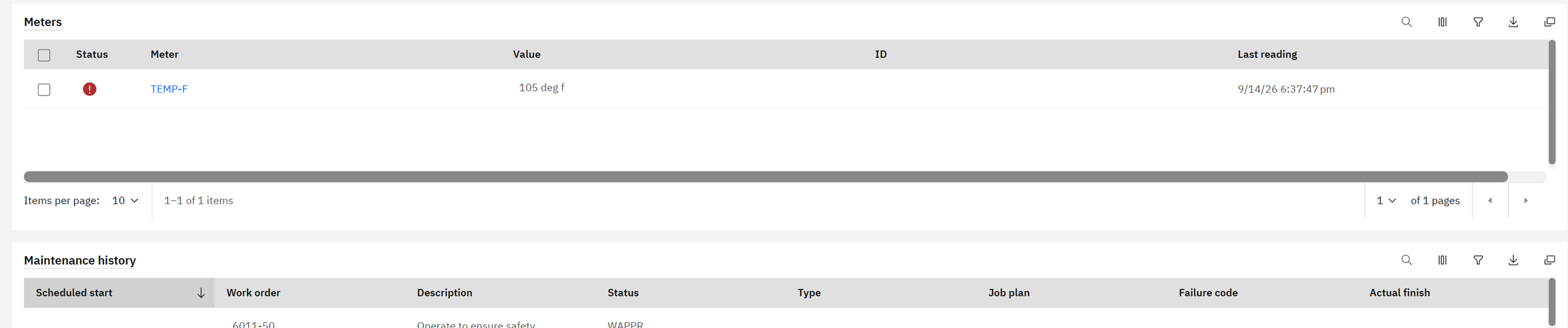
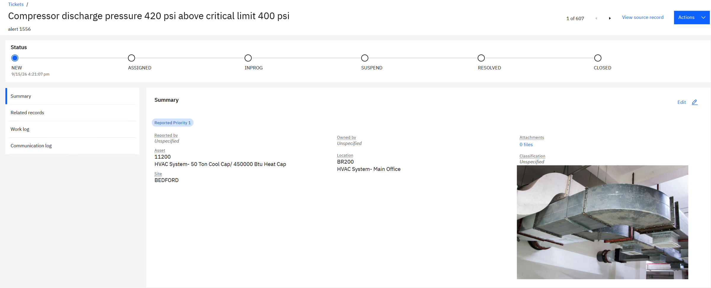
Alerts are raised when a meter reading or a monitoring rule crosses a limit. The urgent one is alert 1556: compressor discharge pressure at 420 psi, above its 400 psi critical limit. The meter list shows the supply air temperature at 105 °F, flagged red.
Each alert is a record in its own right, with a status (new, assigned, in progress, resolved, closed), the asset, the location and the measurement that triggered it, so it can be assigned and followed up like any ticket.
Reliability: how often it fails, and why
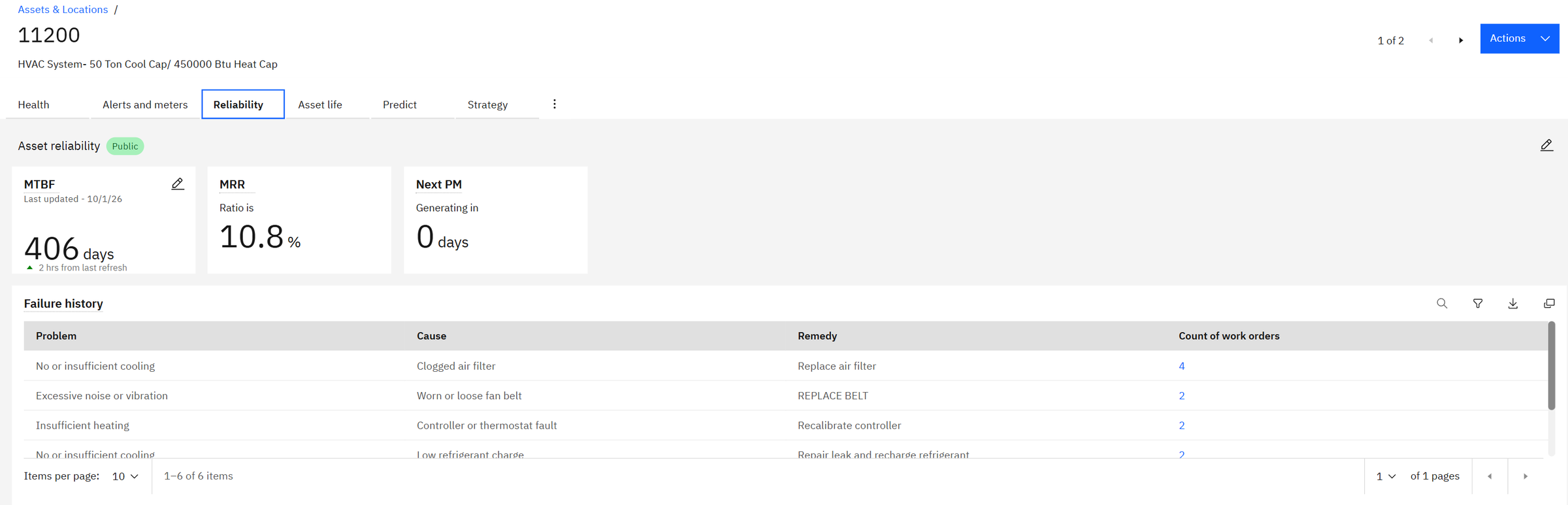
MTBF (mean time between failures) is the average time the asset runs between two breakdowns: here 406 days, a little over a year. The failure history groups past repairs by problem, cause and remedy. For 11200 the top line is "no or insufficient cooling, caused by a clogged air filter, fixed by replacing the filter", four times. A filter is cheap; four cooling failures are not. That is a strong case for a filter change in the preventive maintenance plan.
Asset life: age, cost and end of life
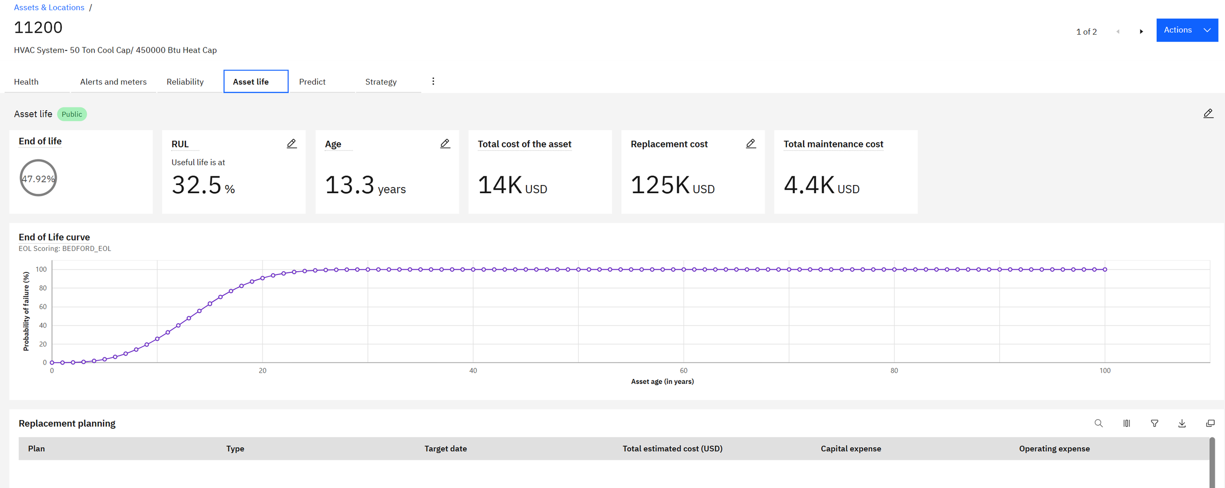
The end-of-life score of 47.92% is our Weibull curve from Chapter 5 at 13.3 years. Total cost so far is $14K, about 11% of the $125K replacement cost. The unit is ageing but not yet a replacement candidate: the money is better spent fixing the causes of its repeated failures. The Replacement planning table below is where that decision is recorded when it comes.
Predict and Strategy: the next two levels
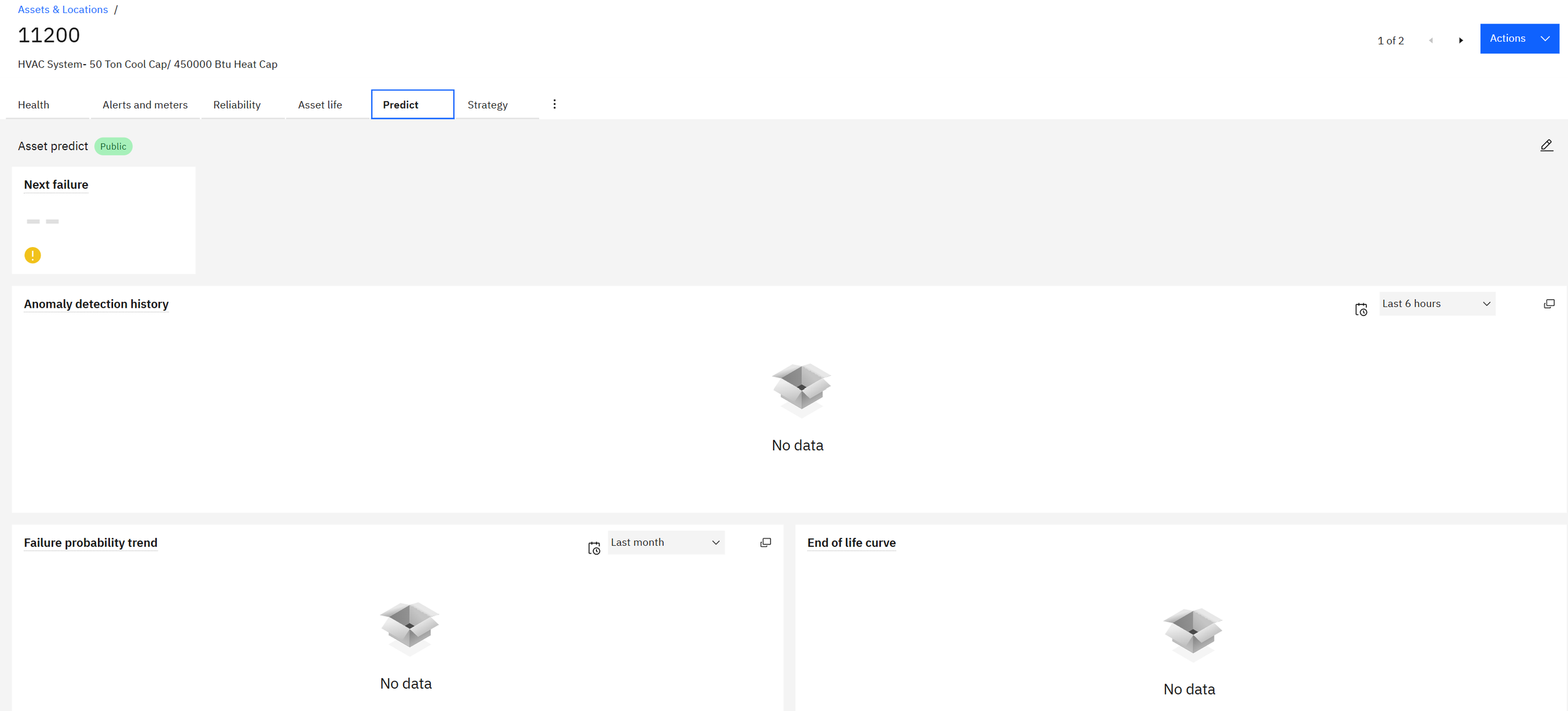
The Predict tab is where machine learning results appear: the predicted date of the next failure, anomalies detected in sensor data, and the probability of failure over time. It is empty here because no Predict model is trained for this asset yet (see Chapter 8).
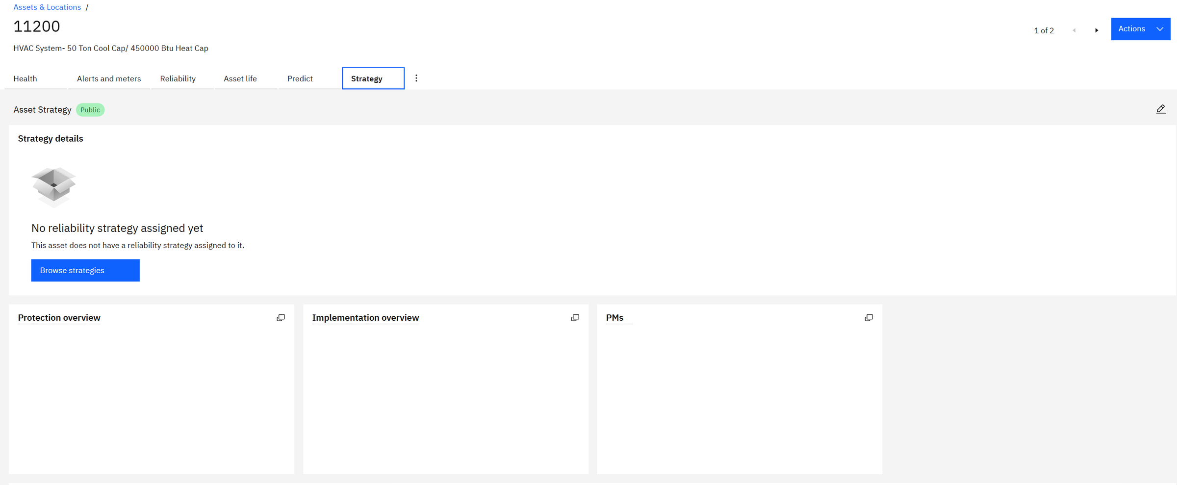
The Strategy tab links the asset to a reliability strategy: a library of the ways this kind of equipment fails and the maintenance tasks that prevent each failure mode. Once assigned, Health shows how well each failure mode is protected by the preventive maintenance actually in place.
Chapter 7The matrix: from scores to decisions
Hundreds of scores are still too many to act on. The matrix crosses two of them, here criticality (rows) and end of life (columns), and counts the assets in each cell. Red cells mean high need for action.
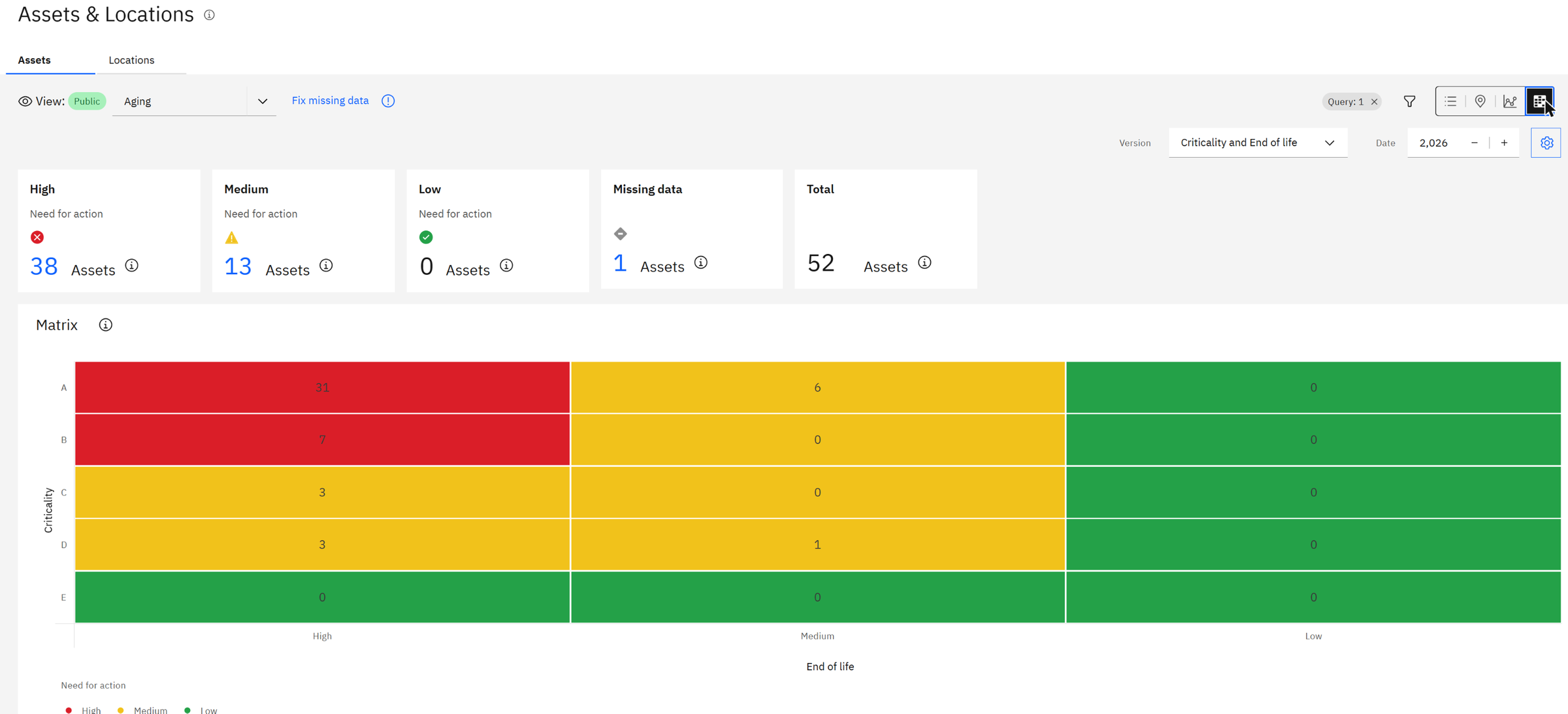
Read the top-left cell: 31 assets are both critical (A) and close to end of life. These are the ones a reliability engineer looks at first. Click the High card and you get the list, ready to export or to turn into replacement plans.
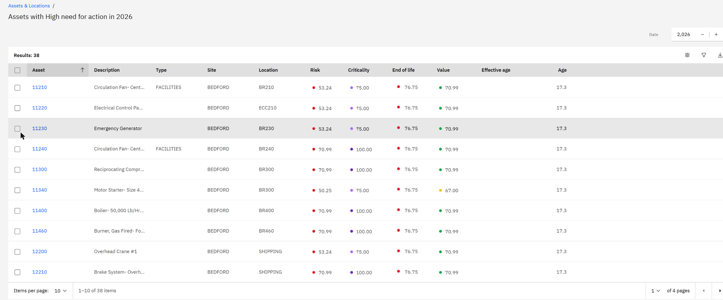
An old asset that nobody depends on can run to failure. A critical asset in good condition can wait. Only the combination tells you where money and time should go first. Health lets you choose both axes, so the same data can answer "what do we replace this year?" and "where is our biggest operational risk?".
Chapter 8Where Maximo Predict comes in
Health scores describe the asset from its records. Predict learns from failure history and sensor data to answer "when?": the probability that an asset fails in the next 30 days, its predicted failure date, or whether its current behaviour is abnormal. Predict models are built in Watson Studio on Cloud Pak for Data, from templates IBM provides.
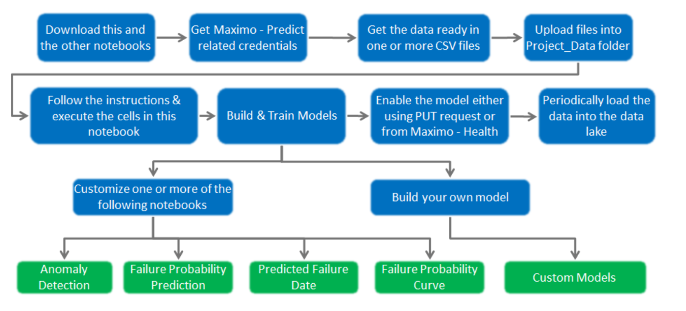
The templates cover the most common needs: anomaly detection, failure probability, predicted failure date, failure probability curves, and custom models. Each trained model is registered against a prediction group in Health.

What this gives the organization
- One objective view of the fleet. Every asset scored the same way, every night, from the data already in Maximo.
- Transparent rules. Every score can be traced to its contributors and weights, so engineers and finance can agree on them.
- Priorities instead of opinions. The matrix turns hundreds of assets into a short list that needs action now.
- Replacement planning backed by evidence. Age, condition, cost and criticality side by side, ready for capital planning.
- Faster diagnosis. AI insights read an asset's whole history and propose the next actions in plain language.
- A path to prediction. Start with rule-based scores, add machine learning models where the data supports them.
Check yourself
1. A health score has three contributors: 40% at score 80, 30% at 50 and 30% at 20. What is the health score?
0.4 × 80 + 0.3 × 50 + 0.3 × 20 = 32 + 15 + 6 = 53: fair.
2. With the default criticality, what score does an asset with priority 3 get?
(3 − 1) × 25 = 50: band C.
3. An age contributor has best 0 and worst 20 years. What does a 5-year-old asset score?
100 × (1 − 5/20) = 75.
4. A Weibull curve has κ = 0.8. What kind of failures does that describe?
Kappa below 1 means early-life failures that become less frequent with age: typically installation or manufacturing defects.
5. A health score has contributors RUL 30 (33%), corrective work 60 (33%) and service requests 90 (34%). What is it?
0.33 × 30 + 0.33 × 60 + 0.34 × 90 = 9.9 + 19.8 + 30.6 = 60.3: fair.
6. An asset is critical (A) but its end of life score is low. Where does it sit in the matrix, and what do you do?
Top row, right column: green. It matters, but it is not wearing out. Keep maintaining it, and watch its health score.
Glossary
- Health score
- Overall condition of an asset, 0 (poor) to 100 (good).
- Criticality
- How important the asset is to the business, A to E.
- Risk
- A score combining health and criticality.
- End of life
- Probability that the asset fails because of its age.
- Contributor
- One measurable input to a score, normalised to 0–100.
- Scoring group
- A set of assets, selected by a query, and the scores calculated for them.
- RUL
- Remaining useful life: the share of the expected life still ahead.
- Weibull curve
- Model of failure probability by age, with characteristic life λ and shape κ.
- Matrix
- Two scores crossed to show which assets need action first.
- MTBF
- Mean time between failures: the average running time between two breakdowns.
- Alert
- A record raised when a meter or monitoring rule crosses a limit.
- AI insights
- A watsonx-generated summary of an asset's condition with recommended actions.
- Prediction group
- The assets a trained Predict model applies to.
Want to see this on your own assets? Send me a message and I'll set up a demo.
Screens: IBM Maximo Application Suite 9 (Health and Predict, Cloud Pak for Data), with IBM's Bedford demo data. All assets, scores and amounts are demo values.